Edit Content
Blueprint – Next-Generation Blog & Magazine Theme 1.1.0
- Recently Updated
- 100% Original Product & Well Documented
Products of the Week

Premium Membership
Download this product for FREE and also gain access to 5,000+ premium themes and plugins.
GPL License
$69.00 Original price was: $69.00.$1.00Current price is: $1.00.
- Verified from VirusTotal
- 100% Original Product and Virus Free.
- Free New Version Lifetime On Single Purchase.
- Unlimited Website Usage
- Price is in US dollars and excluded tax
Sale will end soon
Hours
Minutes
Seconds

Verified From


- Products Are Purchased and Downloaded From Original Authors.
- The File is 100% Completely Untouched and Unmodified.
- Last Update: 22.06.2024
- Version: 1.1.0

Secure Transaction
Your transaction is secure with the Stripe. One of the famous payment gateway
Virus Free
Our all items on our website are Virus free and tested with "McAfee Secure"
Timely Update
After publishing the new update from author we upload the latest file on our website
Product Description and Reviews
Description
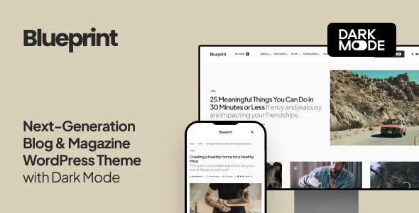
Blueprint: The Ultimate Blog & Magazine WordPress Theme
Blueprint is a cutting-edge WordPress theme designed for modern bloggers and publishers, offering a clean and contemporary design perfect for online media.
9 Importable Demo Sites
Kickstart your blog with 9 pre-built demo sites, complete with posts and images, making it easy to set up your site quickly.
Dark Mode
Activate Dark Mode for a visually pleasing experience in low-light settings. This mode uses a dark color scheme, which can be triggered automatically based on browser settings or manually with a toggle.
Multiple Page Header Types
Blueprint offers three distinct page header types. Choose between a featured post header with an image overlay or a smaller header for a variety of looks.
Smart Colors
Automatically adjust text and link colors based on your background selections, ensuring optimal readability without extensive manual setup.
Instant Live Preview Customization
Configure theme options using the native WordPress Customizer. See changes in real-time without needing to refresh the page, streamlining the design process.
Flexible Archive Layouts
Select from various post archive layouts for your homepage and archive pages, including grid, list, and full layouts, to match your site’s style.
Multiple Page Layouts
Choose from several page layouts for your homepage, archives, posts, and pages. Options include sidebars on the left or right or a full-width layout for your content.
Super-Fast Mega-Menu
Showcase recent posts with thumbnails in the menu dropdown. This feature dynamically loads content only when a user hovers over the menu, ensuring fast load times.
AMP Support
Enable Google Accelerated Mobile Pages (AMP) by activating the official WordPress AMP plugin, matching the main styles of your website for a seamless mobile experience.
Avoid Duplicate Posts
Prevent duplicate content on your homepage by excluding featured posts from the main archive with a simple click, enhancing your site’s SEO.
Google Fonts Integration
Access over 800 Google Fonts to style your website. Select fonts from a dropdown and preview them instantly without any CSS or coding.
Additional Content Placement
Easily add ads, descriptions, or subscribe forms in various template parts without modifying template files. This feature enhances site functionality and monetization.
Smart Sticky Navigation
Optimize mobile navigation by displaying the main menu only when users scroll up. Choose from three options: always sticky, sticky on scroll up, or disabled.
Sticky Sidebar
Enhance user engagement and ad conversions with a sticky sidebar. Options include sticking to the bottom edge or top edge of the last widget, functioning smoothly on all devices.
Advanced Menu Options
Support for unlimited submenu levels ensures flexible content structuring. Submenus appear on the opposite side if there’s no space, and mobile touch devices are fully supported.
Mobile Slide-Out Menu
Display a mobile-friendly menu with a hamburger icon, including social links, subscription forms, and widgets, enhancing mobile navigation.
Paginated Posts
Split long posts into multiple pages with styled pagination for better user experience and engagement.
Guest and Multi-Author Support
Enable guest authors and multi-author posts with the Co-Authors Plus plugin, allowing contributors to have social accounts and bios without separate user accounts.
RTL Language Support
Blueprint includes built-in support for RTL (right-to-left) languages like Arabic and Hebrew, ensuring global accessibility.
Seamless Loading Options
Features like numbered pagination, “Load More” buttons, and Infinite Load encourage users to browse more content without refreshing the page.
Post Views and Reading Time
Display post views synced with Google Analytics and automatically calculate reading time, enhancing user engagement.
Retina-Ready Design
Ensure your site looks stunning on Retina screens with vector scalable elements and clear images.
Optimized Image Sizes
Serve optimized image sizes to save disk space and enhance load times, meeting Google’s best practices for SEO.
Ultra-Responsive
Tested across multiple devices, Blueprint guarantees a high-quality, responsive experience.
Feature-Rich and User-Friendly
Despite its extensive features, Blueprint remains easy to use. Live previews, seamless WordPress integration, and no required coding make it accessible to all users.
SEO by Yoast and Structured Data Support
Enable SEO features like breadcrumbs with Yoast and ensure correct structured data for better search engine rankings.
Developer-Friendly
Numerous hooks and filters make Blueprint ideal for developers looking to create custom solutions. It’s coded with WordPress standards for clean, readable code.
Translation-Ready
Blueprint is translation-ready with a .pot file and compatible with WPML and Polylang for creating multilingual sites.
Monetization and Ads Support
Easily integrate ads and banner spots, including AdSense support, to monetize your site effectively.
Made by Code Supply Co.
Created by a Power Elite Author, Blueprint guarantees timely support and regular updates, backed by the success of their previous themes.
Powered by Powerkit
Blueprint includes Powerkit, an in-house plugin extending theme features like share buttons, social links, sliders, and more, ensuring seamless functionality and design.
Blueprint combines advanced features with ease of use, making it the perfect choice for modern publishers and bloggers looking to create a stunning online presence.
Add a review
You must be logged in to post a review
Log In
Top Selling
$39.00 Original price was: $39.00.$1.00Current price is: $1.00.
$69.00 Original price was: $69.00.$1.00Current price is: $1.00.
$59.00 Original price was: $59.00.$1.00Current price is: $1.00.
$59.00 Original price was: $59.00.$1.00Current price is: $1.00.
$59.00 Original price was: $59.00.$1.00Current price is: $1.00.
$59.00 Original price was: $59.00.$1.00Current price is: $1.00.
Related products
$205.00 Original price was: $205.00.$1.00Current price is: $1.00.
$69.00 Original price was: $69.00.$1.00Current price is: $1.00.
$59.00 Original price was: $59.00.$1.00Current price is: $1.00.
$25.00 Original price was: $25.00.$1.00Current price is: $1.00.





Reviews
There are no reviews yet